


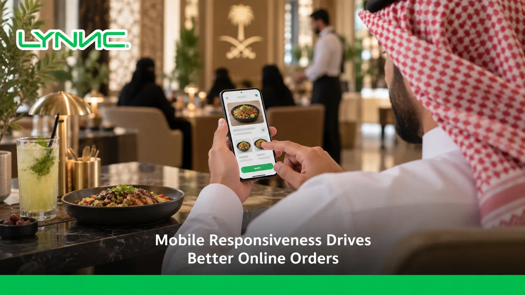
Mobile responsiveness is essential for restaurant online ordering success because it ensures websites and digital menus work smoothly on any device. A mobile-friendly experience improves navigation, speeds up ordering, reduces checkout friction, and helps increase conversion rates. By optimizing mobile ordering through better UX design, responsive layouts, and seamless QR Ordering experiences, restaurants can turn more smartphone visitors into completed orders and satisfied customers.
What Is Mobile Responsiveness and Why Does It Matter for Restaurants?
Mobile responsiveness is the ability of a website, digital menu, or ordering platform to automatically adjust its design and functionality based on the customer’s device screen size.
For restaurants, this means customers can easily browse menus, customize orders, and complete payments whether they are using a smartphone, tablet, or any other device.
A responsive ordering experience is not only about making content visible on smaller screens. It is about creating a smooth customer journey where every step, from discovering menu items to completing an restaurant online store process, feels simple and natural.
With more customers using mobile devices to search for restaurants and place orders, investing in responsive digital experiences has become an essential part of improving mobile ordering performance and increasing customer satisfaction.
Why Mobile Experience Determines the Success of Online Ordering
When a hungry customer lands on a poorly optimized platform, their frustration builds within seconds. The digital experience directly dictates the success of your online ordering operations, and ignoring mobile adaptability leads to severe operational and financial consequences.
Here are the primary problems of non-responsive websites:
Difficult Menu Navigation: Customers are forced to pinch and zoom just to read dish descriptions or find specific categories.
- Small Buttons: Unclickable or clustered buttons make selecting items or modifying ingredients a frustrating task.
- Slow Page Loading: Heavy, unoptimized desktop images consume massive data, causing the menu to load incredibly slowly on mobile networks.
- Too Many Ordering Steps: A cluttered interface forces buyers through unnecessary pages just to add a single item to their cart.
- Cart Abandonment Before Payment: When the checkout screen is not scaled for mobile, users lose trust or run into errors, leaving the order before paying.
Ultimately, these friction points destroy your conversion rate and severely damage customer satisfaction, pushing potential diners directly to competitors with smoother platforms.
.webp)
Key Features Every Restaurant Needs for a Mobile-Friendly Ordering Experience
To capture and retain digital customers, your platform must be built with the mobile user in mind. Implementing these essential features guarantees a flawless LYNNC for restaurant technologyexperience:
Fast Loading Pages: The digital menu and ordering interface must open instantly, allowing users to browse without staring at loading screens.
- Simple Navigation: Customers must have effortless access to the Menu, specific Categories, their Cart, and the Checkout page with a single tap.
- Mobile-Friendly Menu Design: The layout should feature clear, optimized images, bold and readable prices, and easily accessible customization options for dietary preferences.
- Easy Checkout Process: The system must reduce payment steps to an absolute minimum, utilizing auto-fill data and digital wallets to finalize the transaction rapidly.
Key Benefits of Mobile Responsiveness for Restaurants
A responsive mobile experience helps restaurants improve both customer engagement and operational performance. Here are the main benefits:
Increasing Online Orders
A simple and accessible mobile interface makes it easier for customers to complete their orders instead of leaving before checkout.
Improving Conversion Rate
Removing obstacles such as difficult navigation, slow pages, and complicated checkout steps helps increase the percentage of visitors who complete their purchases.
Reducing Customer Drop-Off
When customers can quickly find menu items and complete payments without frustration, restaurants reduce abandoned orders.
Supporting QR Ordering Experiences
Since most customers scan QR codes using smartphones, responsive digital menus ensure a smoother transition from scanning the code to placing the order.
Creating Better User Experience
A well-designed mobile experience builds customer confidence and encourages repeat ordering.
Simplifying Restaurant Operations
When mobile ordering connects with systems such as a restaurant management system, restaurants can manage orders more efficiently and reduce manual errors.
How Mobile Responsiveness Improves Online Ordering Conversion Rates
There is a direct, measurable relationship between a responsive interface and financial success: a superior Mobile UX leads to more orders, which generates a higher conversion rate.
Here is how optimizing for smartphones improves your bottom line:
Reducing Cart Abandonment: A smooth, responsive checkout process prevents users from getting frustrated and abandoning their selected meals.
- Increasing Order Completion: When buttons are highly visible and navigation is intuitive, customers complete the purchasing journey much faster.
- Improving User Experience: A site that feels like a native app builds brand trust, making the customer feel secure while entering payment details.
- Increasing Average Order Value: Highly responsive visual prompts for add-ons and side dishes encourage impulse buying without cluttering the screen.
A Step-by-Step Approach to Optimizing Restaurant Ordering for Mobile Users
Transforming your digital storefront requires a systematic approach. Here is a practical guide to optimizing the journey for smartphone users:
Step 1: Analyze Your Current Mobile Ordering Journey
Navigate your own platform using a smartphone. Identify exactly where the friction occurs, how long it takes to place an order, and where a customer might get stuck.
Step 2: Simplify Your Digital Menu
Remove massive text blocks and compress image sizes. Ensure categories are collapsible and items are neatly organized so users can scroll vertically with ease.
Step 3: Improve Navigation and Checkout
Implement sticky navigation bars so the "View Cart" button is always visible. Streamline the checkout by offering guest checkout options and digital wallet integrations.
Step 4: Test Across Different Devices
Do not assume your platform works universally. Test the ordering flow rigorously across various iPhone models, Android devices, and tablets to ensure layout consistency.
Step 5: Monitor User Behavior
Use analytics tools to constantly track your conversion rate and monitor abandoned orders. Identify at which specific step users drop off and adjust the interface accordingly.
The Role of UX Optimization in Restaurant Online Ordering Success
UX optimization goes beyond just fitting elements on a screen; it is about anticipating the customer's needs and removing every possible barrier between them and their meal.
Clear Design: Utilizing ample white space and readable fonts prevents visual overwhelm, allowing the food to stand out.
- Product Images: High-quality, properly scaled pictures instantly trigger appetite and drive faster decision-making.
- Fast Access to Ordering: Prominent "Order Now" calls-to-action ensure the user knows exactly where to tap the second the page loads.
- Reducing Friction: Eliminating mandatory account creations and simplifying the input fields keeps the momentum moving toward payment.
- Personalizing the Experience: Remembering past orders or favorite locations for returning mobile users makes reordering a one-tap process.
Mobile Ordering Before and After Responsive Optimization
| Before Mobile Optimization | After Mobile Optimization |
|---|---|
| Customers need to zoom in to read menu items | Menus automatically adapt to mobile screens |
| Difficult navigation between categories | Clear and simple menu browsing |
| Small buttons create ordering mistakes | Easy-to-click buttons improve interaction |
| Slow pages increase customer frustration | Faster loading improves user experience |
| Long checkout process causes abandoned orders | Smooth checkout increases completed orders |
| Poor QR menu experience | Seamless QR Ordering journey |
A responsive platform transforms mobile ordering from a frustrating process into a convenient digital experience that encourages customers to complete their purchases.
Why Mobile Responsiveness Matters for Saudi Restaurants
The restaurant industry in Saudi Arabia is rapidly adopting digital ordering solutions, making mobile optimization an important factor for businesses that want to compete effectively.
Modern Saudi restaurants need mobile experiences that support:
Arabic and English Digital Menus
Customers should be able to browse menus easily in their preferred language with clear product descriptions and pricing.
Fast Mobile Ordering
Customers expect quick access to menus and simple ordering journeys without unnecessary steps.
QR Ordering Adoption
As QR-based ordering becomes more common in restaurants, responsive designs ensure customers can scan, browse, and order smoothly from their phones.
Mobile Payment Experiences
Responsive ordering platforms should provide a seamless path from selecting items to completing payment through preferred digital payment methods.
Multi-Branch Management
Restaurant groups need connected solutions that allow them to manage menus, orders, and operations across multiple locations.
Integration With Restaurant Technology
A successful digital ordering experience requires connection between customer-facing platforms and backend systems such as a restaurant management system.
Choosing the Right Technology to Support Mobile Ordering Growth
Scaling your digital sales requires more than just a basic website; it demands a comprehensive technology ecosystem designed specifically for modern hospitality.
When selecting technology, restaurants must look for:
Mobile-Friendly Ordering: Platforms built from the ground up to operate flawlessly on any smartphone browser.
- QR Ordering: Allowing dine-in guests to scan a code and instantly access a mobile-optimized interface.
- Digital Menu: Cloud-based catalogs that update in real-time without requiring users to download heavy PDF files.
- Order Management: A backend system that seamlessly catches every digital request and routes it properly to the kitchen.
- Restaurant Management System: A unified platform that connects front-of-house digital sales with back-of-house operations smoothly.
Why LYNNC Helps Restaurants Create Better Mobile Ordering Experiences
LYNNC provides the essential tools required to turn digital friction into a seamless revenue stream.
QR Ordering: Provides diners with immediate, lightning-fast access to the ordering flow directly from their tables.
- Digital Menu: Delivers a highly responsive, visually appealing catalog that adapts perfectly to any customer's device.
- Order Management: Centralizes incoming requests from mobile users to completely reduce kitchen errors and missed tickets.
- Restaurant Management System: Unifies digital ordering with overall operations, giving owners complete control over the mobile dining experience.
guide to restaurant Online Ordering Without Delivery App Commissions
Conclusion: Turn Mobile Visitors Into Restaurant Customers With Better UX
Mobile responsiveness is the ultimate deciding factor in modern digital hospitality. By prioritizing fast loading times, intuitive navigation, and frictionless checkout, restaurants can instantly boost their conversion rate and build lasting digital loyalty. Transforming a frustrating web page into a smooth, app-like experience ensures that every tap on a smartphone translates into a completed order.
Ready to Improve Your Restaurant’s Mobile Ordering Experience?
Discover how LYNNC helps restaurants combine mobile-friendly ordering, QR Ordering, and restaurant operations into one connected experience.
Frequently Asked Questions About Mobile Responsiveness and Online Ordering
What is mobile responsiveness and why is it important for restaurants?
Mobile responsiveness is a design approach that ensures a website automatically adapts its layout to fit any screen size perfectly. It is crucial for restaurants because customers increasingly browse menus and place orders using their smartphones.
How does mobile responsiveness affect online ordering conversion rates?
By eliminating zooming, fixing unclickable buttons, and improving page loading speed, responsive design reduces user frustration. This smoother experience helps prevent cart abandonment and can improve the overall conversion rate.
Why do restaurants need mobile-friendly ordering systems?
Customers expect fast and convenient ordering experiences. If an ordering system is difficult to navigate on a smartphone, customers may leave the platform and choose a competitor with an easier ordering process.
How can UX optimization improve the mobile ordering experience?
UX optimization focuses on creating clear layouts, attractive product displays, simple navigation, and fewer checkout steps. This helps customers find what they need quickly and complete their orders with less effort.
Does QR Ordering work better with mobile-responsive menus?
Yes. Since QR codes are usually scanned through smartphones, the destination menu should be optimized for mobile devices. A responsive design helps customers browse items easily and complete their orders smoothly.
What features should a restaurant mobile ordering system include?
A restaurant mobile ordering system should include fast loading pages, simple navigation, clear menu categories, visible cart buttons, item customization options, and a smooth checkout process that supports digital payment methods.
How can restaurants improve their online ordering conversion rate?
Restaurants can improve conversion rates by simplifying their digital menus, creating a fully mobile-responsive ordering experience, reducing unnecessary checkout steps, and using a reliable restaurant management system to manage operations efficiently.

